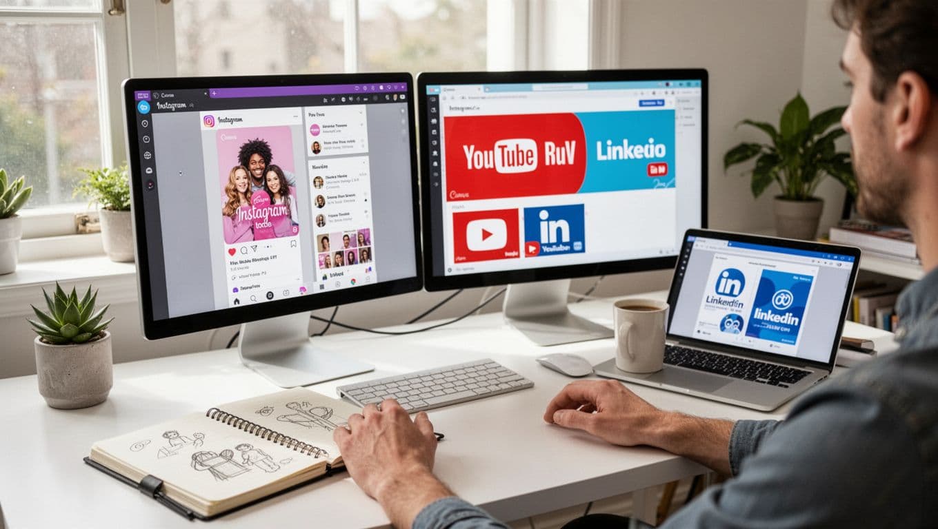
I used Canva Magic Studio this week for a real workload, social posts, a YouTube thumbnail, a simple ad variant, and a short motion clip. The goal was simple: move faster without shipping “template energy” or off-brand visuals.
If you’re a marketer, creator, founder, or part of a small team, this is the exact promise Canva sells. One place to write, design, edit photos, translate, resize, and export. In 2026, that “one place” matters because content rarely stays in one format for long.
In this review, I’ll tell you what sped up my workflow, what still needs a human eye, and when I’d pick something else. Some features are free, but the best AI tools tend to sit behind Pro or Teams, and pricing or credit limits can change, so I’m focusing on outcomes, not hype.
Not just AI generation, it’s AI inside a real design system
A lot of AI design tools feel like vending machines. You type a prompt, you get an image, then you scramble to make it usable. Canva flips that. Magic Studio lives inside a full design workflow, with templates, brand controls, asset libraries, team collaboration, and exports that don’t break at the finish line.
That’s the difference between “I generated something” and “I published something.”
For background on the broader category, I like this plain-English explainer on what an AI image generator is. Canva’s angle is that the generator is only one step in the chain.
Here’s what I mean by “design system” in normal terms:
- Templates that behave: Layouts that already follow basic spacing and hierarchy rules.
- Brand Kit guardrails: Colors, fonts, and logos that stay one click away.
- Resize and export formats: Social sizes, print-ready PDFs, transparent PNGs, and more.
- Shared libraries: Stock assets, uploaded product shots, icons, and past designs.
- Collaboration and handoff: Comments, versions, and quick edits without file chaos.
Canva introduced Magic Studio as a bundled suite back in 2023, and that “suite” framing still shapes the product today. If you want the original context, Mashable’s write-up on Canva’s Magic Studio announcement captures the early positioning well.
The Magic Studio tools I actually use (and what each one is good at)
When I’m working fast, I don’t touch every button. I stick to a small set:
Magic Design helps when I need a first draft layout, especially for social cards and simple ads. I use it for structure, not for final polish.
Magic Write is my “tighten the copy” tool. It’s best for captions, headlines, and short CTAs that need to fit the design, not for long-form writing.
Magic Switch 3.0 is the quiet time-saver. It’s the difference between “make five sizes” and “make five sizes and keep them consistent.” I also use it for translation variants when I’m testing new audiences.
Style Match and Magic Morph are useful, but I treat them like spice. A little goes far. They help create textures, patterns, and a cohesive vibe, yet they can also make everything look like a trendy template if I overdo it.
Magic Expand, background removal, object removal, and targeted recolor are the tools that feel the most “real” in day-to-day work. They don’t try to invent an entire scene, they fix the stuff that slows me down.
Text-to-image inside Canva is fine for backgrounds and conceptual visuals. Still, if I need a hero image with strict art direction, I’m more likely to generate elsewhere and finish in Canva.
Brand consistency at scale, where Canva is quietly strong
AI makes it easy to produce a lot. It also makes it easy to drift.
What keeps Canva Magic Studio usable for teams is that it pushes brand choices into the workflow. In my projects, that means I can build with guardrails instead of policing everything at the end.
Before I generate anything, I run a quick internal check: brand colors and which ones are “accent only,” approved fonts, tone of voice, a short do-not-say list, and logo rules (clear space and no stretching). That tiny step prevents most of the “why does this look like us?” debates later.
If your team is weighing Canva against other beginner-friendly suites, this comparison helped me frame the tradeoffs: Adobe Express vs Canva 2025 comparison. Canva still feels more like a content factory, while Adobe often feels stronger when you want tighter creative control.
From idea to multi-platform assets in minutes (my fastest repeatable workflow)
My fastest loop in 2026 looks like this: pick the goal, generate two to four drafts, choose one layout, swap imagery, rewrite copy, resize, then export. I keep it boring on purpose because boring is repeatable.
This matters if you post across Instagram, TikTok, YouTube Shorts, LinkedIn, and email, because each platform wants a different crop and pacing. The hard part isn’t making one good design. It’s making six versions that still look like the same campaign.
One prompt, many outputs: posts, ads, thumbnails, and short videos
I start with a single idea and treat Canva like a kit builder. One headline theme becomes a post, a story, a thumbnail, and a simple ad variant.
My best results happen when I keep prompts concrete: audience, offer, vibe, and the one action I want. Then I reuse the same headline structure across formats so the campaign feels connected.
Canva’s motion tools are handy for turning a still into a short clip, especially for social. I treat the output like a draft, then I export a few options and pick the cleanest one. Subtle motion wins more often than flashy movement.
Magic Switch 3.0 for translation without wrecking the layout
Translation usually breaks design. Text expands, line breaks shift, and suddenly your CTA looks like it got squeezed in with a shoehorn.
Magic Switch helps by translating while keeping the layout style. In early 2026, Canva has been positioning this as a “translate at scale” feature, with support for 150-plus languages in many accounts. I still do a quick QA pass every time:
Check line breaks, confirm the CTA still reads clearly, verify date and number formats, and protect brand words that should not be translated (product names are the classic failure point).
My rule: if a translated design takes longer than a manual rewrite, I stop and simplify the copy first.
Canva Magic Studio for non-designers, why it feels easier than most AI tools
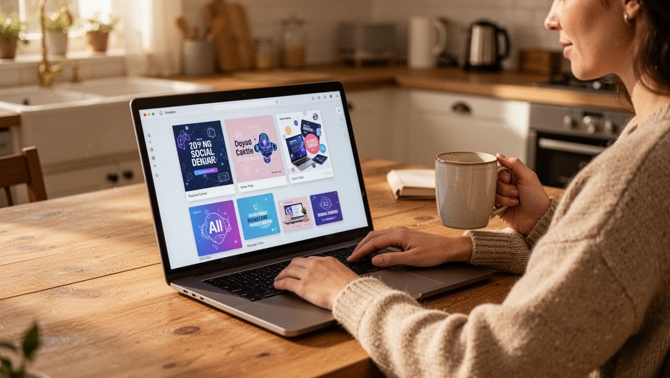
If you don’t design for a living, Canva’s biggest advantage is confidence. You’re rarely staring at a blank canvas. Templates give you a safe starting point, and Magic Design gives you options when you don’t know what you want yet.
That’s why Canva Magic Studio often beats “prompt-only” tools for normal business work. It turns “I need a graphic” into “here are three usable drafts,” then it nudges you to fix the obvious stuff.
The learning curve is smaller, because the AI guides the next step
I notice this most when I’m tired or rushed. The interface keeps suggesting the next action: pick a template, adjust brand colors, refine text, resize for a new platform, export.
For non-designers, a few constraints make your work look better instantly: stick to two fonts, use one accent color, keep text short, and always check contrast (if you have to squint, your audience will scroll).
What I still do manually to keep designs from looking “template-y”
This is the part people skip. AI gets you to “fine.” Manual tweaks get you to “believable.”
Dead giveaways I watch for, plus my quick fix:
- Overstuffed layouts: Remove one element, increase spacing, and let the headline breathe.
- Generic stock photos: Swap in a real product shot or a custom visual background.
- Flat hierarchy: Make the headline larger, then reduce supporting text by 20 percent.
- Too many effects: Drop shadows and gradients are fine, but pick one, not five.
If you do nothing else, change the spacing. It’s the easiest way to make a design feel intentional.
AI photo and visual editing that saves me real time
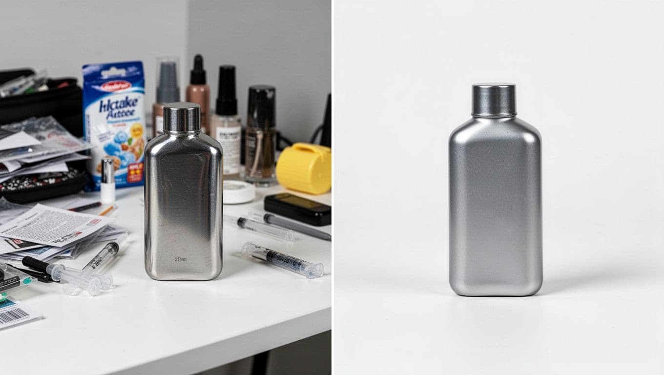
This is where Canva earns its keep for me. A year ago, cleaning up product shots could eat an afternoon. Now it’s often minutes, even if I do a couple of retries.
I’m not saying it replaces a pro photo editor for complex composites. Still, for everyday marketing needs, removing a background, deleting distractions, isolating a subject, or recoloring an item is the kind of work that used to block momentum.
Point-and-click edits that feel almost unfair (in a good way)
Object removal and background removal are the obvious ones. The real boost is that Canva makes these edits approachable for beginners. You don’t need to understand layers to get a clean result.
Three scenarios I run into all the time:
E-commerce cleanup: remove clutter from a product photo, then drop the item into a consistent background for ads.
Creator thumbnails: isolate a face, increase contrast, and get a punchier composition without a complicated toolchain.
Ad refresh: keep the same offer, swap a background color, and update a seasonal accent in minutes.
Image-to-video is handy, but I treat it like a draft, not magic
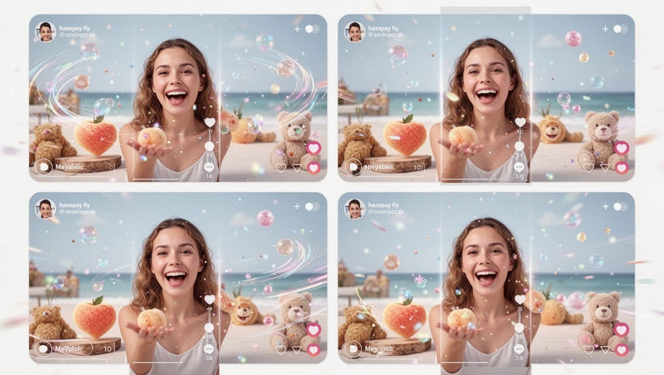
Canva’s image-to-video style motion is best for simple clips: a gentle push-in, a slight parallax feel, or light animated accents. It can look great on social, where “good enough and on time” often beats “perfect but late.”
Some images fail, though. Busy patterns can cause weird warping, and hands or small details sometimes get artifacts. My guardrails are simple: start with a clean, high-res photo, keep motion subtle, and export multiple options.
If you want a bigger picture of how these tools work, this guide on what AI video generators are is a good baseline.
Where Magic Studio falls short (hard truth before you buy)
The tradeoff is speed versus originality. Canva Magic Studio helps me ship more, faster. It doesn’t automatically make my brand look more unique.
In early 2026, Canva’s AI bundle also comes with credit limits that shape your real usage. Free users tend to hit ceilings fast, and even paid plans can cap certain AI features. Canva has adjusted packaging over time, so I always check limits before I commit to a campaign.
Here’s the rough way I think about value (not a promise of current pricing, because Canva changes this):
| Plan (typical) | Best for | What can bite you |
|---|---|---|
| Free | Testing the workflow | Tight AI credits and feature caps |
| Pro | Solo creators, marketers | Monthly AI limits on some tools |
| Teams | Small teams sharing a brand | Per-seat cost adds up if you scale |
A recent third-party take I broadly agree with is that Canva shines for fast, on-brand marketing output, but it can feel “template-native” for high-end creative. This 2026 review echoes that split: Canva AI review with pricing and verdict.
Quality control is still on me, especially for unique brands
The most common issues I see:
Generic results, style drift across assets, awkward text breaks, and designs that look like everyone else’s Canva post.
My fixes are consistent: use Style Match carefully, bring your own photos when it matters, set brand rules before generating, and do a final human pass for spacing, hierarchy, and tone.
When I reach for other tools instead
I leave Canva when the job needs advanced photo compositing, high-end video editing, complex vector illustration, or strict brand systems with lots of layout rules.
In other words, Canva is my fast content engine. It isn’t always the final stop for premium creative.
So, is Canva Magic Studio still the best all-in-one AI design suite in 2026? For my day-to-day marketing and content work, yes, as long as I accept the quality ceiling and stay disciplined about brand consistency.
This week, I’m running one real campaign through it, a social post set, a thumbnail, and a short clip. If it saves me hours without making my brand look generic, it stays in my stack. If not, I’ll keep Canva for quick drafts and finish the “hero” work elsewhere.